10 Unique Album Cover Wall Decor Styles for Your Home
Remember that moment when you first held a vinyl record and thought, “This artwork is too good to just sit on a shelf”? Yeah, me too. That’s exactly how I ended up with half my music collection on my walls instead of in storage bins. And honestly? Best decorating decision I ever made.
Album covers aren’t just protective sleeves for music – they’re legitimate art pieces that tell stories, capture eras, and spark conversations faster than any generic print from a home goods store. I’ve spent the last five years perfecting different album cover displays in every room of my house (yes, even the bathroom), and I’m here to share what actually works versus what just looks good on Pinterest.
Whether you’re a vinyl junkie with crates full of records or someone who just appreciates iconic album art, turning those covers into wall decor transforms any space into a personal music museum. Let’s talk about how to do it right without making your place look like a dorm room or a record store explosion.
Vintage Vinyl Gallery Wall
Why Vintage Vinyl Hits Different
There’s something about vintage album covers that modern ones just can’t touch. The artwork from the 60s and 70s was absolutely unhinged in the best possible way. Artists actually painted these covers, photographers spent weeks on single shots, and designers weren’t constrained by digital templates.
I started my vintage vinyl wall with three Beatles albums I found at an estate sale. Now I’ve got 27 covers spanning from 1955 to 1979, and each one tells a story. The best part? People actually stop mid-conversation to stare at them. Try getting that reaction from a “Live, Laugh, Love” sign.
My current vintage lineup includes psychedelic Pink Floyd, minimalist Blue Note jazz covers, and some wonderfully weird prog rock albums that look like fever dreams. The variety keeps it interesting without looking chaotic.
Creating Authentic Gallery Vibes
The trick to a vintage vinyl gallery wall is treating it like an actual gallery, not just slapping records on the wall. I learned this after my first attempt looked more like a yard sale display than curated art.
Here’s what transforms random records into gallery-worthy displays:
- Consistent spacing between frames (I stick to 3 inches)
- Mix of album sizes (LPs, 45s, and even some 78s)
- Strategic lighting (picture lights or spots make everything pop)
- Quality frames that protect the covers
- Small labels with artist and year (museum-style)
Finding Vintage Gems Without Going Broke
Real talk: vintage vinyl can get expensive fast. But you don’t need first pressings of Dark Side of the Moon to create an amazing wall. The secret is knowing where to look and what to grab.
My go-to hunting spots:
- Estate sales on Sunday afternoons (prices drop)
- Thrift stores in wealthy neighborhoods
- Record store dollar bins (hidden treasures exist)
- Facebook Marketplace from people who “just want them gone”
- Garage sales in older neighborhoods
I once scored 15 pristine jazz albums for $20 because the seller just wanted the space back. Those same albums now anchor my living room gallery wall.
Minimalist Album Art Display
Less Really Can Be More
After going maximalist with my vintage wall, I wanted something cleaner for my home office. Enter the minimalist album display. Three to five carefully chosen albums can make a bigger statement than a wall covered in records.
I chose albums with simple, iconic designs: The White Album, Unknown Pleasures by Joy Division, and The Velvet Underground & Nico. Black frames, white mats, perfect spacing. The restraint nearly killed me, but the result? Chef’s kiss.
The Art of Album Selection
Choosing albums for a minimalist display is harder than it sounds. You need covers that work as standalone art pieces, complement each other without matching exactly, and mean something to you personally.
My selection criteria:
- Strong graphic elements that read from across the room
- Cohesive color palette (or intentionally contrasting)
- Personal significance (no point displaying albums you don’t care about)
- Timeless design that won’t feel dated
- High-quality artwork that looks good enlarged
Spacing and Arrangement Mathematics
Minimalist doesn’t mean random. The spacing needs to be intentional and consistent. I literally used a tape measure and level for two hours setting up five albums. My friends think I’m insane, but the precision makes all the difference.
Golden rules for minimalist spacing:
- Equal distance between all frames
- Center point at 57-60 inches from floor
- Breathing room of at least 6 inches between pieces
- Odd numbers often work better than even
- Consider the wall space as part of the composition
Color-Coordinated Music Wall
The Rainbow Effect That Actually Works
Organizing albums by color sounds like something from an influencer’s feed, but hear me out – when you nail the color coordination, it’s absolutely mesmerizing. I arranged 20 albums in a gradient from deep purple to bright yellow, and it’s the first thing anyone comments on.
The trick isn’t perfect color matching. Albums aren’t paint swatches. Instead, I group by dominant colors and let the variations create visual texture. My blue section ranges from navy to cyan, and somehow it all works together.
Building Your Color Story
Start by pulling all your albums and sorting them into color families. You’ll quickly realize some colors dominate (hello, black metal albums) while others are rare. Work with what you have rather than forcing a perfect rainbow.
My current color wall breakdown:
- Reds: 6 albums (mostly rock and punk)
- Blues: 8 albums (lots of jazz and electronic)
- Greens: 3 albums (surprisingly rare)
- Yellows/Golds: 5 albums (classic rock territory)
- Black/White: 12 albums (saved for a separate monochrome section)
Making Transitions Smooth
The magic happens in the transitions between colors. I overlap colors that naturally blend – blue to purple, yellow to orange, green to blue. The gradient effect tricks your eye into seeing more cohesion than actually exists.
Pro tip: photograph your arrangement before hanging anything. Phone photos help you spot weird color jumps you might miss in person. I rearranged mine four times before committing to the wall.
Also Read: 10 Beautiful Hallway Wall Decor Ideas for a Cozy Vibe
DIY Framed Record Covers
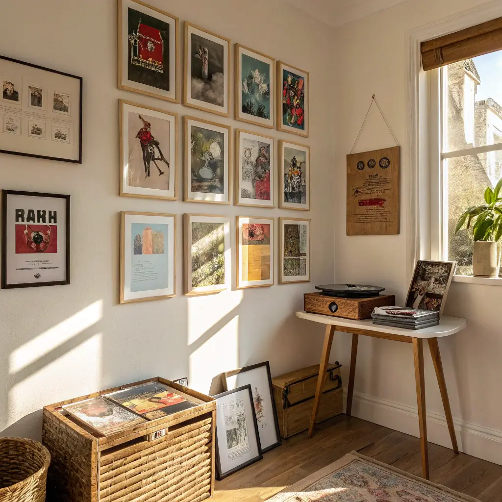
The Frame Game Strategy
Framing your own album covers saves serious money and gives you complete control. I’ve framed over 30 albums myself, and the difference between DIY and professional framing costs is astronomical – we’re talking $15 versus $60 per album.
My setup cost $200 initially for materials and tools, but I’ve framed everything since basically for free. Plus, I can swap albums whenever I want without crying about wasted framing costs.
Materials That Won’t Break the Bank
You don’t need fancy equipment to frame album covers like a pro. My entire framing setup fits in a closet, and the results look professional enough that people ask where I get them done.
Essential supplies:
- 12.5″ x 12.5″ frames (standard for LP covers)
- Mat board in white or black
- Frame backing material
- Mounting corners (never glue albums!)
- Glass cleaner and microfiber cloths
- Basic cutting tools and ruler
Skip the custom mats initially. Pre-cut mats work perfectly for standard album covers, and nobody notices the difference unless they’re inspecting with a magnifying glass.
The Assembly Line Method
I frame albums in batches – it’s way more efficient than doing them individually. Set up an assembly line on your dining table and knock out five or six at once. The repetition makes you faster and more precise.
My framing process:
- Clean glass and let dry completely
- Position album in frame using corners
- Add mat board (if using)
- Insert backing and secure
- Clean glass again (fingerprints always appear)
- Add hanging hardware consistently
FYI, the whole process takes about 10 minutes per album once you get the rhythm down. My record (pun intended) is eight albums in an hour.
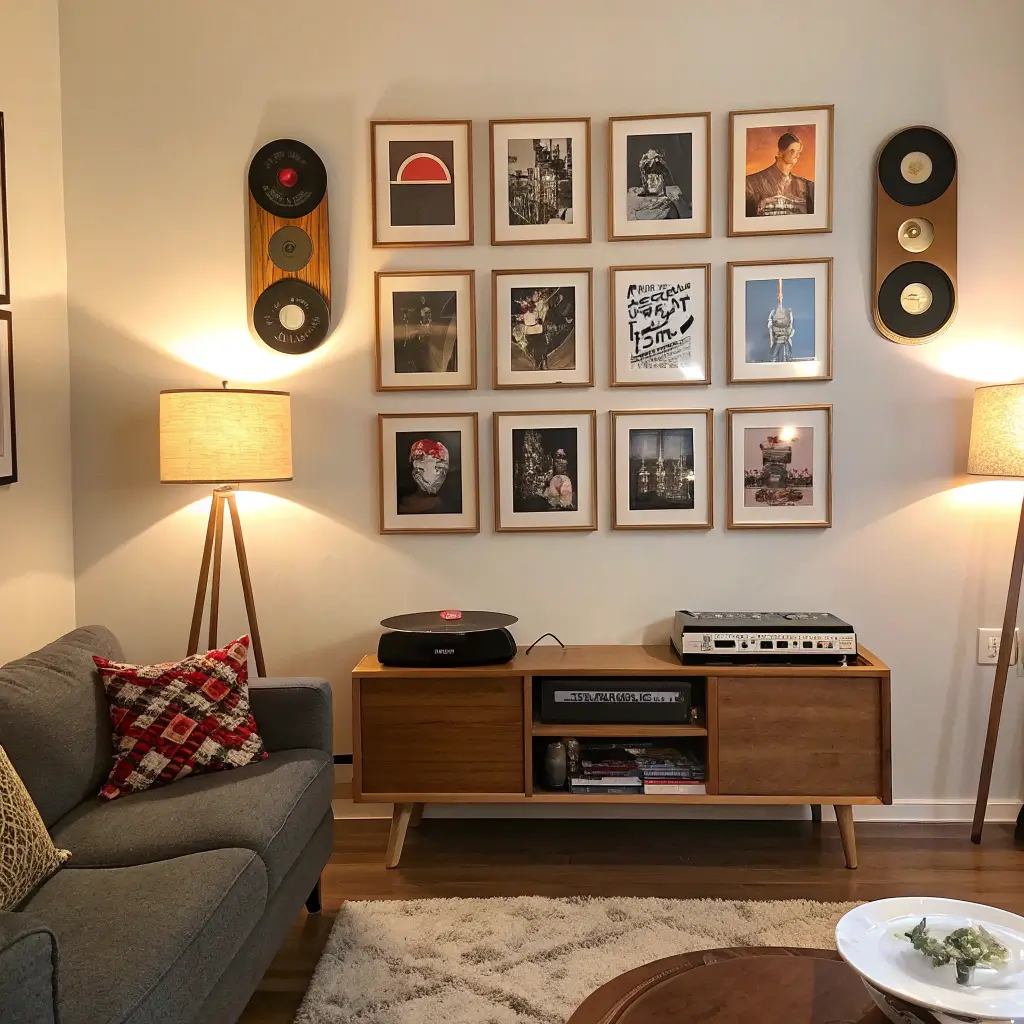
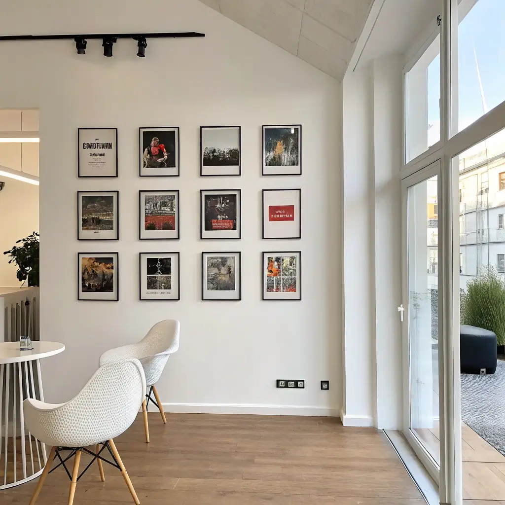
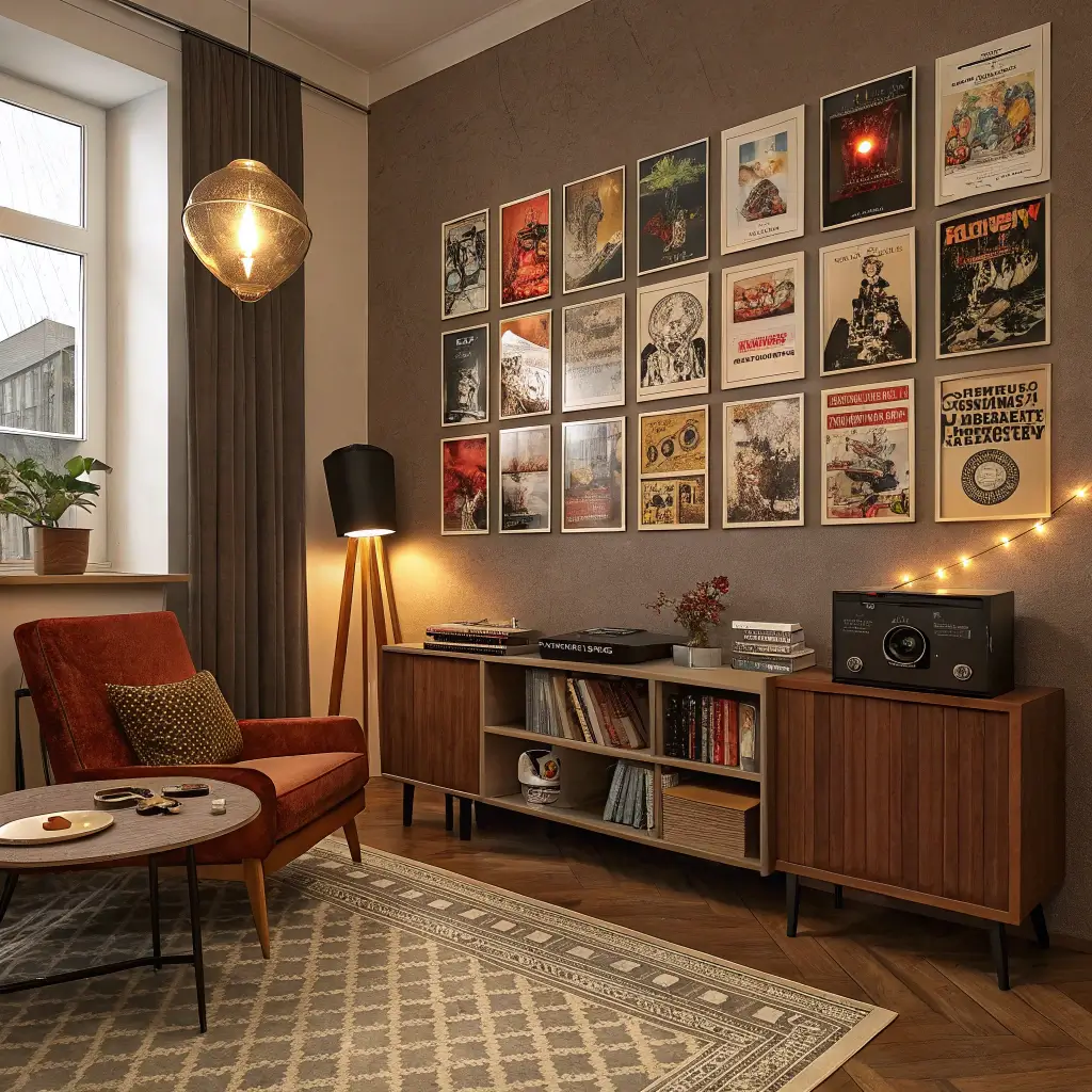
Modern Pop Culture Wall Grid
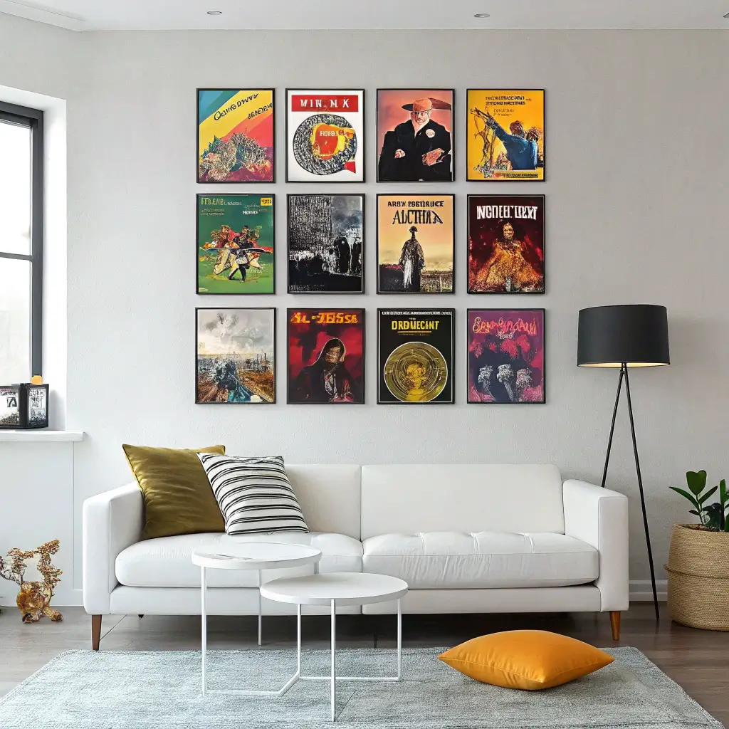
Mixing Music Eras Like a DJ
Who says you can’t put Taylor Swift next to Black Sabbath? Modern pop culture walls celebrate everything from K-pop to classic rock, creating conversations through unexpected combinations. My grid has Beyoncé neighboring Bowie, and honestly, they look great together.
The grid format keeps chaos in check. Even with wildly different artistic styles, the uniform spacing and arrangement creates cohesion. It’s organized rebellion, if that makes sense.
The Perfect Grid Formula
Creating a grid sounds simple until you’re standing there with 16 albums and analysis paralysis. The secret? Start with your corners and work inward. I always place my strongest, most colorful covers at the corners to frame everything else.
Grid mathematics that work:
- 3×3 for smaller walls (my bedroom setup)
- 4×4 for statement walls (living room centerpiece)
- 3×5 for hallway displays
- 2×6 for narrow vertical spaces
Leave exactly 2 inches between frames. Any more looks disconnected; any less feels cramped. Yes, I measured. Yes, it matters.
Balancing Different Artistic Styles
The challenge with pop culture grids is making Metallica and Mariah Carey look intentional together. I balance heavy and light, colorful and monochrome, vintage and modern throughout the grid rather than clustering similar styles.
My balancing act:
- Never put two super dark covers adjacent
- Spread color pops evenly throughout
- Mix photography and illustration
- Balance text-heavy and image-focused covers
- Create diagonal lines with similar elements
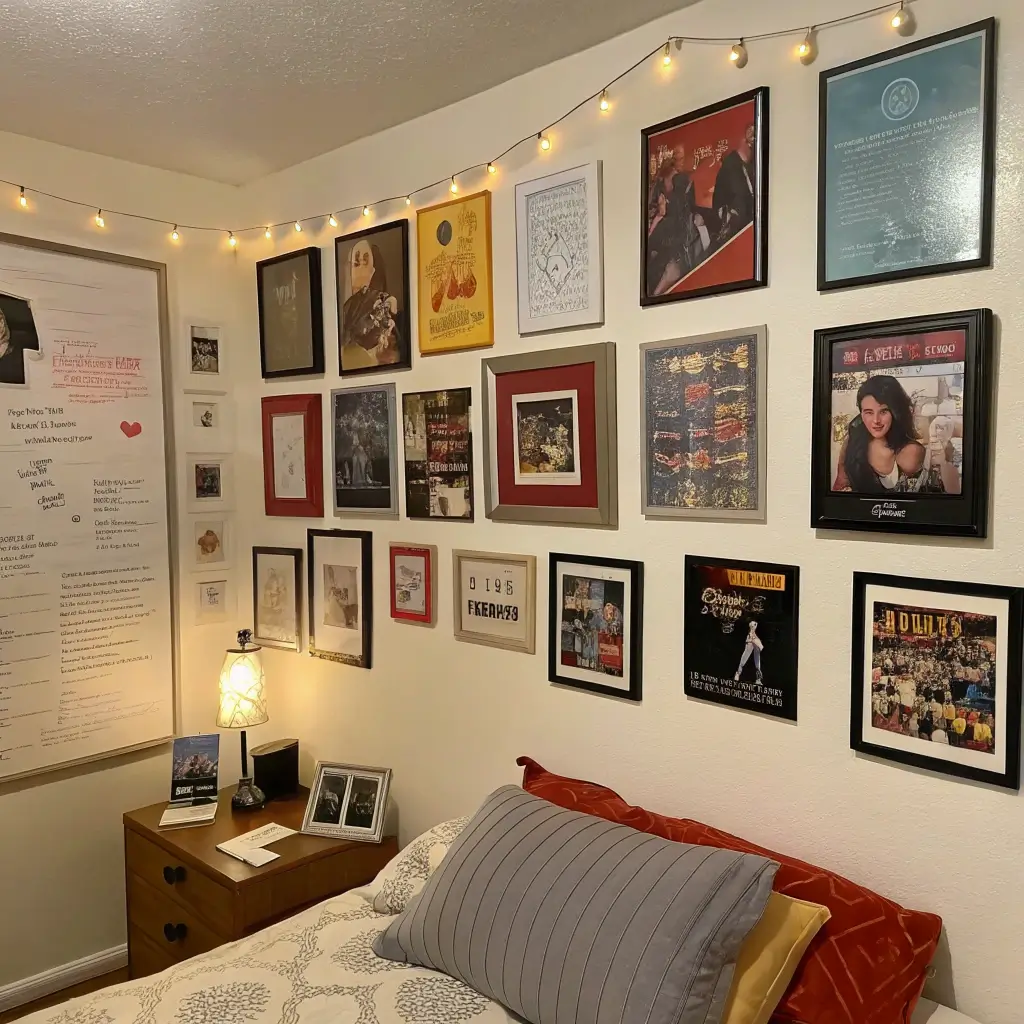
Eclectic Album Cover Collage
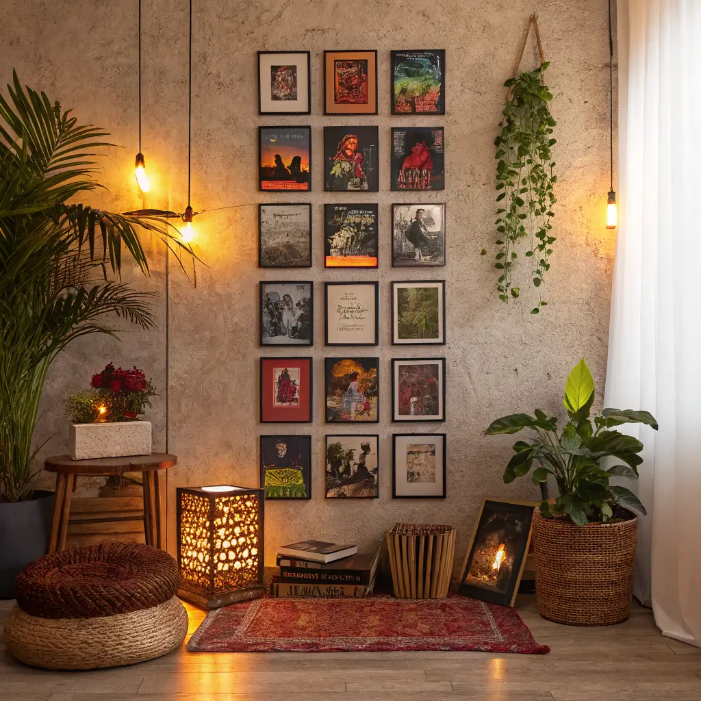
Controlled Chaos That Works
Forget everything I said about organization – sometimes you need beautiful chaos. My bedroom wall features 43 album covers in various sizes, overlapping and arranged organically. It looks like my music collection exploded, but in an intentional, artistic way.
The collage style works when you have too many favorites to follow rules. Instead of agonizing over perfect placement, you let the albums find their own rhythm. Some overlap, some stand alone, some cluster in groups.
Building Layers Without Looking Messy
The difference between artistic collage and dorm room mess? Intentional layering. I start with larger pieces as anchors, then build around them with smaller covers, 45s, and even concert tickets.
Layering hierarchy:
- Base layer: Largest albums, evenly distributed
- Second layer: Medium covers, partially overlapping
- Third layer: 45s and small memorabilia
- Final touches: Pins, tickets, stickers (sparingly!)
The key is knowing when to stop. I physically step back every five additions to check the overall balance. When it starts feeling heavy, I’m done.
Making It Look Intentional
Random doesn’t mean careless. Even my “chaotic” collage follows some loose rules. I maintain color balance throughout, ensure no single area becomes too dense, and create visual pathways for the eye to follow.
Hidden structure tricks:
- Create invisible triangles with similar colors
- Maintain some breathing room (not everything touches)
- Echo shapes across the collage
- Include a few perfect alignments among the chaos
- Leave one deliberate empty space (it adds tension)
Also Read: 10 Chic Bathroom Wall Decor Ideas to Elevate Your Style
Monochrome Music Wall Aesthetic
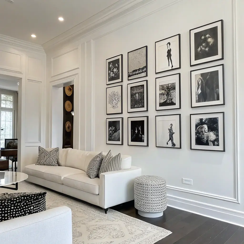
Why Black and White Slaps So Hard
There’s something powerful about stripping music artwork down to pure black and white. My monochrome wall features only albums with black and white covers, and the cohesion is absolutely stunning. It’s proof that limitation breeds creativity.
The Beatles’ White Album, Joy Division, Johnny Cash’s American Recordings, some Blue Note jazz – the variety within the constraint surprises people. Plus, it goes with literally any room design.
Finding Monochrome Masterpieces
You’d be surprised how many iconic albums feature black and white artwork. Once I started looking, I found them everywhere. The challenge becomes curating rather than searching.
My monochrome hall of fame:
- Classic rock: Led Zeppelin, The Clash, Velvet Underground
- Jazz: Dozens of Blue Note releases
- Modern: The Strokes, Arctic Monkeys, Jack White
- Hip-hop: Jay-Z’s Black Album, Kendrick’s good kid, m.A.A.d city
- Alternative: Joy Division, The National, Interpol
Creating Depth Without Color
Without color to create visual interest, you need other elements to keep the wall dynamic. I play with frame styles, sizes, and arrangements to add layers to the monochrome display.
Depth-creating techniques:
- Mix frame colors (black, white, natural wood)
- Vary mat widths
- Include some frameless floating displays
- Play with lighting and shadows
- Incorporate different album sizes
Floating Shelves with Album Covers
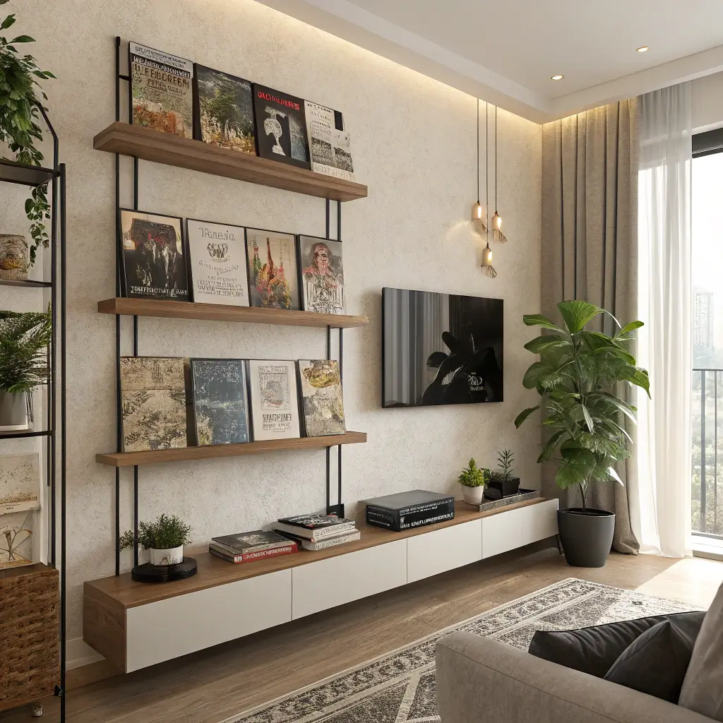
The Rotating Gallery Concept
Floating shelves changed my album display game completely. Instead of committing to one arrangement, I rotate my displayed albums monthly. It keeps the room fresh and lets me show off more of my collection.
I installed picture ledges specifically designed for albums – they have a lip that keeps records from sliding off but doesn’t obscure the artwork. Six shelves, five albums each, thirty albums on display at any time. Living the dream.
Shelf Arrangement That Doesn’t Suck
The mistake everyone makes? Lining up shelves like library stacks. Boring! I stagger my shelves at different heights and lengths, creating a dynamic display that draws your eye around the wall.
My current shelf setup:
- Top shelf: 48 inches, holds 7 albums
- Second: 36 inches, offset right, holds 5
- Third: 48 inches, aligned with top, holds 7
- Fourth: 24 inches, offset left, holds 3
- Bottom: 36 inches, centered, holds 5
The Art of Album Rotation
I keep a rotation schedule in my phone (nerd alert!), but it keeps things fresh. Each month gets a theme – British Invasion, Women in Rock, Local Artists, etc. The anticipation of changing displays actually makes me appreciate my collection more.
Rotation themes that kill:
- Decades (all ’70s, all ’90s, etc.)
- Geographic (Seattle sound, Motown, British)
- Color stories (all blue covers, all red)
- Seasonal vibes (summer jams, winter moods)
- Genre deep dives (pure jazz, only punk)
Retro Album Poster Arrangement
Blowing Up the Classics
Sometimes album covers deserve to be bigger. I transformed classic album artwork into poster-sized prints, and the impact is insane. Seeing Dark Side of the Moon at 24×24 inches hits different than the standard 12-inch square.
High-resolution scans or official poster releases work best. I’ve collected both official reprints and created my own (for personal use, obviously). The larger scale lets you appreciate details invisible on standard albums.
Mixing Sizes for Visual Interest
My poster wall combines three massive 24×24 prints with several standard album covers and some medium 18×18 reproductions. The size variation creates movement and prevents the wall from feeling flat or predictable.
Size hierarchy that works:
- One massive centerpiece poster
- 2-3 large supporting posters
- 5-7 standard album covers
- A few small 45 covers as accents
- One unexpected size (maybe a CD or cassette for scale?)
Creating Poster-Worthy Displays
Not every album cover works blown up. Detailed artwork sometimes becomes muddy at scale, while simple designs gain power. I learned this after enlarging a busy prog rock cover that looked amazing small but terrible as a poster.
Albums that scale beautifully:
- Bold graphics (Pink Floyd, Joy Division)
- Simple photography (Abbey Road, Born to Run)
- High contrast designs (White Stripes, The Clash)
- Iconic imagery (Nirvana’s Nevermind, Bowie’s Aladdin Sane)
Also Read: 10 Stunning Kitchen Wall Decor Ideas for Stylish Homes
Personalized Favorite Albums Wall
Making It Deeply Personal
Forget what’s cool or valuable – this wall is pure personal connection. My favorites wall features albums that changed my life, regardless of their artistic merit or collector value. Yes, there’s some embarrassing stuff up there. No, I don’t care 🙂
This wall tells my musical journey from age 13 to now. The progression from pop-punk to jazz fusion is hilarious, but it’s honest. Visitors always spend the most time at this wall because it reveals personality in ways other displays don’t.
Telling Your Music Story
I arranged my favorites chronologically, creating a timeline of my musical evolution. Each album includes a small card explaining its significance – first concert, breakup soundtrack, road trip anthem, whatever.
Story elements that resonate:
- First album you bought with your own money
- Album that got you through tough times
- Discovery that changed your taste
- Gift from someone special
- Random find that became an obsession
Adding Context Without Cluttering
The challenge is adding personal notes without making it look like a museum exhibit. I use minimal labels – just enough to spark conversation without overwhelming the visual display.
Context-adding tricks:
- Small date labels in corners
- QR codes linking to playlists (tech-savvy!)
- Tiny photo prints tucked behind frames
- Concert tickets displayed alongside
- Handwritten lyrics on small cards
IMO, this is the wall that matters most. Anyone can display famous albums, but showing your actual favorites, including the guilty pleasures? That takes guts.
Making Your Album Wall Actually Happen
Look, I get it – starting an album cover wall feels overwhelming. You’re staring at your collection wondering where to begin, worried about putting holes in walls, convinced you’ll mess it up. Everyone feels this way. I rearranged my first display approximately 47 times before committing.
Start small. Pick five albums you love, grab some simple frames, and create one focused display. You can always expand, rearrange, or completely start over. The beauty of album cover decor is its flexibility – nothing’s permanent unless you want it to be.
The biggest mistake is waiting for the “perfect” setup. Your wall will evolve as your collection grows and your taste refines. My walls look nothing like they did five years ago, and that’s exactly the point. They grow with you, tell your story, and give your music collection the spotlight it deserves.
So grab those albums hiding in your closet, pick up some frames this weekend, and start building something amazing. Your walls are begging for personality, and those album covers are ready to deliver. Trust me, once you see your favorite music transformed into wall art, you’ll wonder why every wall isn’t covered in albums.
Now if you’ll excuse me, I just scored a first pressing of Kind of Blue at a yard sale, and I need to figure out where it’s going. The struggle is real, but totally worth it :/