10 Elegant Crochet Wall Decor Ideas for Aesthetic Rooms
Remember when you finished your first crochet project and thought, “This is way too pretty to just use as a dishcloth”? Yeah, that’s exactly how I stumbled into the wonderful world of crochet wall decor.
What started as me not knowing what to do with a beautiful granny square ended up completely changing how I approach both my craft and my home’s aesthetic.
Crochet wall decor is honestly one of the most satisfying ways to merge your crafting hobby with interior design. Unlike those mass-produced prints everyone has (you know the ones),
handmade crochet pieces bring genuine warmth, incredible texture, and personality that you simply can’t buy off a shelf. Plus, there’s something undeniably cool about casually mentioning
“Oh, I made that” when someone compliments your walls.
Whether you’ve got a yarn stash that’s taken over half your house (guilty) or you’re just starting to see crochet as more than scarves and blankets,
I’m about to walk you through some seriously gorgeous crochet wall decor ideas that’ll make your blank walls infinitely more interesting.
Boho Crochet Mandala Wall Hanging
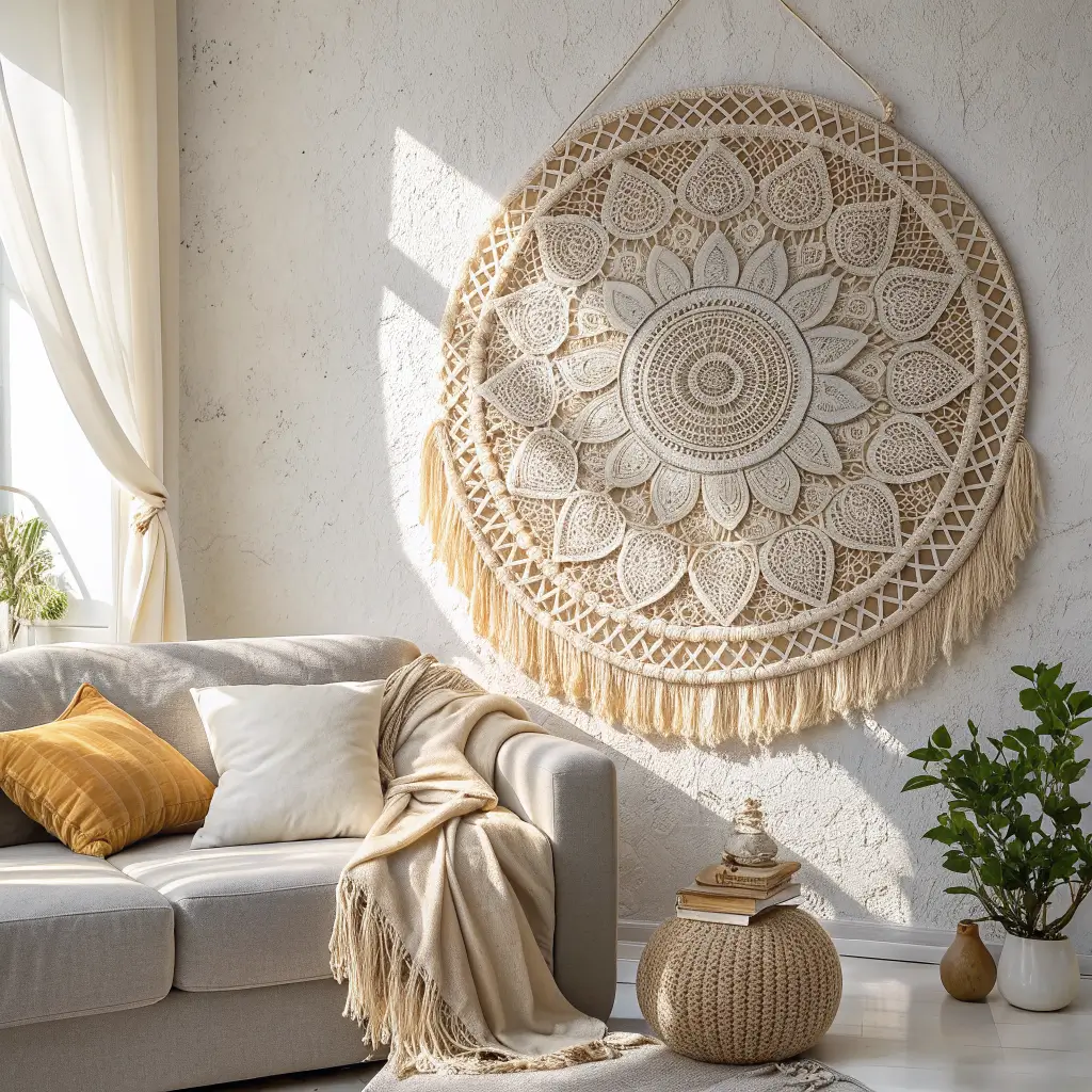
Let’s kick things off with probably the most popular crochet wall decor style—the boho mandala. I made my first one about three years ago, and honestly, I haven’t stopped making them since. There’s something almost meditative about crocheting in circular rounds, watching patterns emerge from the center outward.
Why mandalas work so well for wall decor: The circular, symmetrical design naturally draws your eye and creates an instant focal point. The radiating patterns add depth and movement, while the layered rounds create beautiful dimension that flat art just can’t match.
Choosing your color palette: This is where you get to have serious fun. I’ve experimented with everything from rainbow gradients to monochromatic schemes, and each approach delivers completely different vibes:
- Neutral boho – Creams, tans, and natural cotton colors create that classic bohemian feel
- Sunset gradients – Oranges, pinks, and purples transitioning outward
- Ocean vibes – Blues and teals fading into whites
- Earthy tones – Terracotta, mustard, olive green, and rust
Size considerations: Don’t go too small with mandalas intended for wall display. I learned this the hard way when I spent weeks on a 12-inch mandala that looked completely lost on my living room wall. Aim for at least 24-36 inches in diameter for real impact. Yes, it takes longer, but the results are worth every single stitch.
Mounting and display: I’ve tried multiple approaches here. Stretching the mandala over a canvas board works well and keeps it flat. Mounting on an embroidery hoop creates that trendy hoop art look. My favorite method? Attaching it to a painted circular wood backing—it gives the piece substance and makes it feel more like intentional art than craft.
Pattern selection tips: Look for patterns with clear definition between rounds and interesting stitch variations. Popcorn stitches, clusters, and relief stitches add the textural depth that makes mandalas genuinely stunning. Flat, uniform stitches can read as one-dimensional from a distance, which kind of defeats the purpose.
The blocking reality: FYI, you absolutely cannot skip blocking your mandala. I’ve tried, and the results were sad and wonky. Pin it out on blocking mats, spray it down (or steam it), and let it dry completely. This step transforms your piece from floppy circle to crisp, defined artwork.
Minimal Crochet Hoop Art
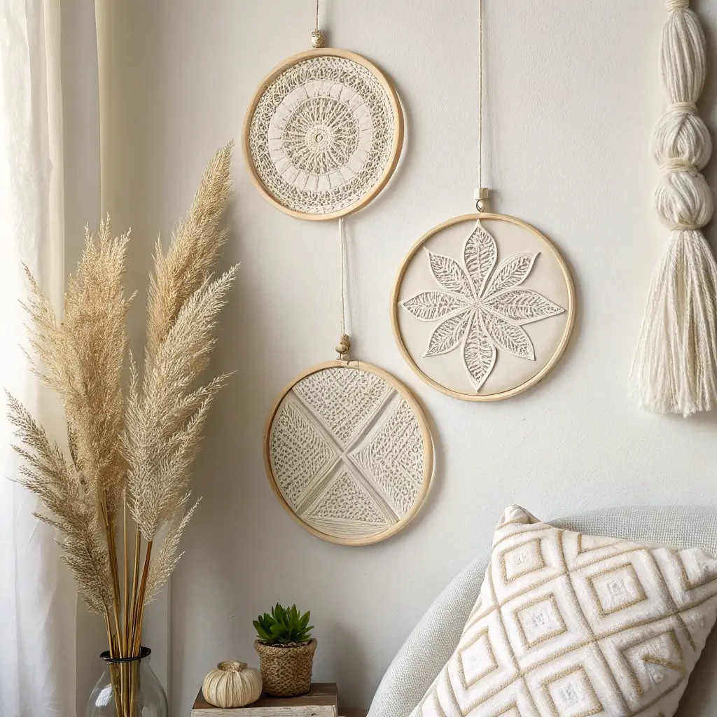
Ever notice how crochet and minimalism don’t typically show up together at the same party? Well, they should. Minimal crochet hoop art proves that you can embrace clean, simple aesthetics while still incorporating handmade texture and warmth. I created several pieces for my bedroom, and they deliver exactly the calm, uncluttered vibe I was after.
What defines minimal crochet art: Think restrained color palettes, geometric precision, clean lines, and intentional negative space. You’re making deliberate choices about simplicity rather than just doing less.
Design approaches that work:
- Single-color pieces in white, cream, black, or gray
- Simple geometric patterns like grids, stripes, or chevrons
- Small-scale designs that prove their point without shouting
- Smooth, even tension (messy stitches don’t fit minimalism)
My go-to minimal technique: I create tightly worked panels using simple stitches—single crochet or half double crochet—with high-quality cotton yarn. The evenness creates an almost fabric-like texture that reads as sophisticated rather than crafty.
Hoop selection matters: The embroidery hoop itself becomes part of the design in minimal work. I use natural wood hoops for warmth or matte black metal hoops for modern edge. The hoop color should complement your crochet work without competing with it.
Pattern ideas: Horizontal stripes in varying widths look incredibly chic. A single geometric shape centered on solid background creates impact through restraint. Subtle textural variations using different stitches in the same color add interest without complexity.
Why non-crocheters love this style: IMO, minimal crochet hoop art is the gateway piece for people who think all crochet looks like their grandmother’s doilies. When you frame a beautifully executed geometric piece, even design snobs recognize it as legitimate art.
Technical requirements: Unlike boho pieces where slight irregularities add charm, minimal work demands consistency. Your stitches need to be even, your tension steady, and your edges clean. I actually find this meditative—the focus required for perfect consistency is oddly soothing.
Textured Crochet Wall Tapestry
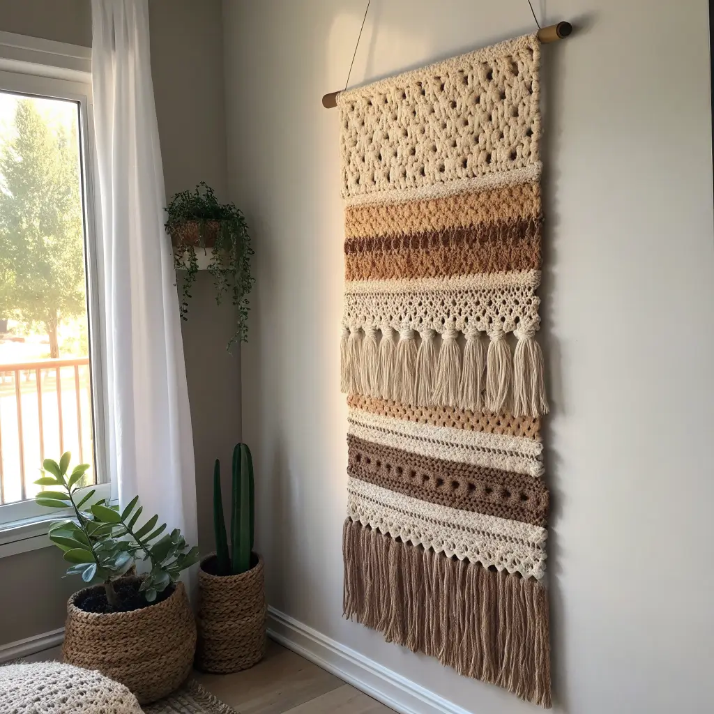
Tapestries bring serious visual weight and warmth to walls, and when you create them in crochet with deliberate texture variations, you’ve got something truly special. I made a large textured tapestry for my dining room, and the play of different stitches and raised elements creates dimension that changes throughout the day as light shifts.
Building texture through stitch variation: This is where your stitch vocabulary really pays off. I combine different techniques within one piece:
- Bobbles and popcorn stitches – Create dramatic raised elements
- Front post and back post stitches – Add subtle ribbing and depth
- Shell stitches – Provide wave-like texture
- Spike stitches – Create visual interest through height variation
Planning your tapestry design: I sketch my ideas on graph paper first, marking which sections use which stitch patterns. This planning prevents mid-project panic when you realize your texture placement isn’t working. Each square on my graph paper represents a stitch, and I use different symbols for different stitch types.
Size and scale: Tapestries need to be substantial to justify the effort and make proper impact. I don’t bother with anything smaller than 24×36 inches. My largest piece measured 40×50 inches and took two solid months of work, but it’s absolutely the showstopper of my entire home.
Color strategies for textured work: You’ve got two main approaches here. Monochromatic textured tapestries let the dimension do all the talking—the shadows and raised elements create the visual interest. Multi-colored versions add another layer of complexity where color transitions work alongside texture changes.
Mounting heavy tapestries: These pieces get seriously heavy, especially at larger sizes. I thread a wooden dowel through the top edge, then suspend the dowel from wall-mounted brackets. This distributes the weight evenly and allows the tapestry to hang flat without warping or sagging.
Adding fringe for movement: I’ve made textured tapestries both with and without fringe. The fringe adds gorgeous movement and softens the bottom edge. I typically go with cut fringe in varying lengths—it’s easier than knotted fringe and creates that flowing, organic feel that works beautifully with textured work.
Also Raed: 15 Creative Small Foyer Ideas Entryway for Beginners
Floral Crochet Wall Panels
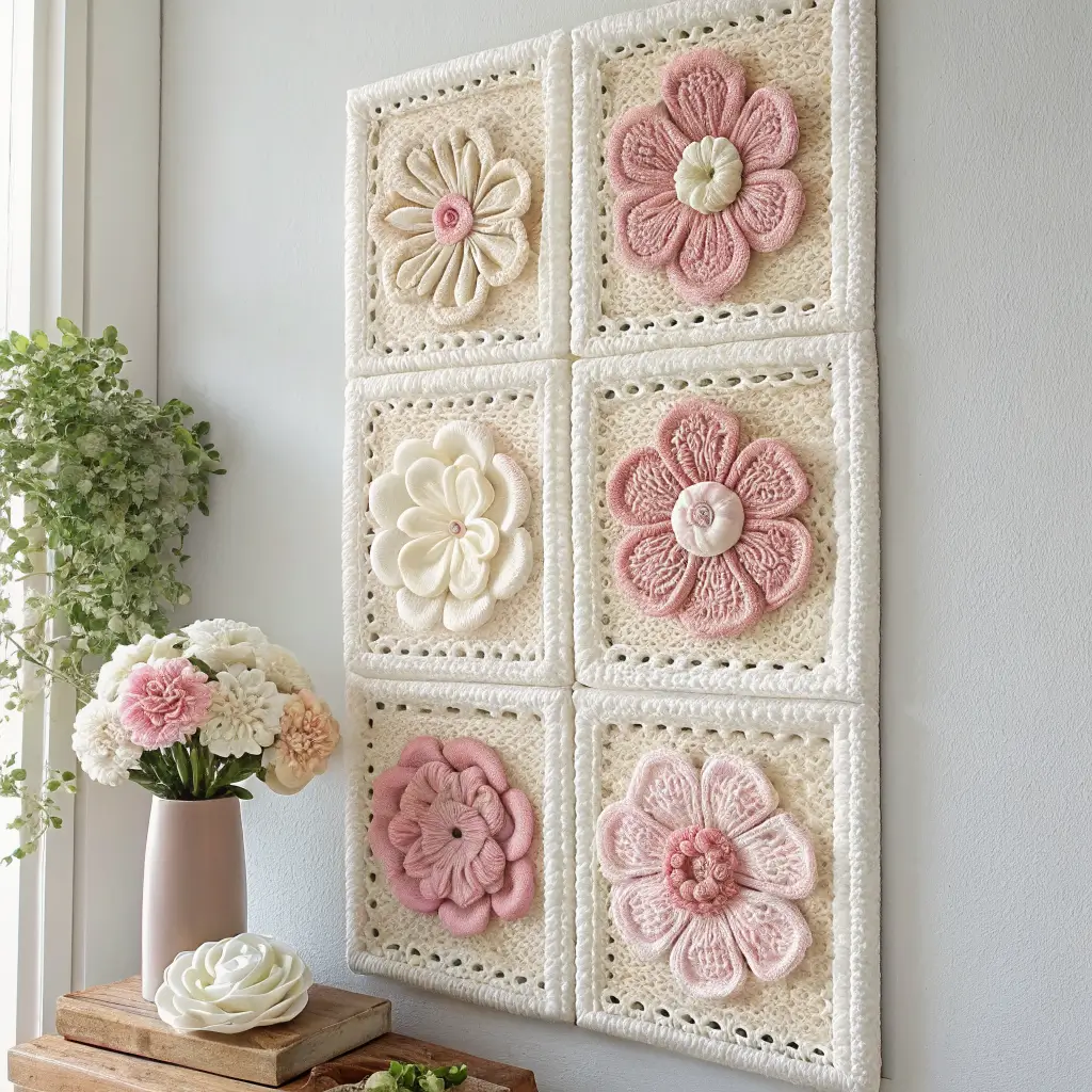
Flowers and crochet are basically a match made in heaven, right? Floral crochet wall panels take this classic pairing and elevate it to something genuinely artistic. I created a set of three floral panels for my guest room, and they bring this fresh, garden-inspired vibe that guests always comment on.
Design approaches for floral panels:
- Realistic 3D flowers – Individual flowers crocheted and attached to a background panel
- Flat appliqué flowers – Simpler flowers sewn onto a solid crocheted background
- Abstract floral patterns – Using color and stitch work to suggest flowers without literal shapes
- Botanical silhouettes – Flowers and leaves in solid colors against contrasting backgrounds
My favorite method: I crochet a solid background panel in a neutral color (usually cream or soft gray), then create individual flowers in various sizes and attach them in an arrangement that feels organic rather than rigid. The 3D flowers pop off the background, creating shadows and depth that flat appliqué can’t match.
Flower selection: Not all crochet flowers translate well to wall art. I’ve found that roses, daisies, and poppies work particularly well because they have clear, recognizable shapes. Super complex or delicate flowers can look muddy from a distance. Keep it clear and bold for maximum impact.
Color palettes that work:
- Soft pastels on white backgrounds for vintage cottage vibes
- Bold jewel tones on charcoal for dramatic modern look
- Monochromatic flowers in varying shades of one color for sophistication
- Wild garden mix with multiple flower colors for cheerful energy
Creating sets vs. single panels: I’ve done both, and each approach works differently. A single large floral panel makes a statement on its own. Sets of three or five smaller panels arranged together create a gallery-style display that feels more dynamic and allows for different flower arrangements on each panel.
Practical considerations: Dust accumulates on 3D elements more than flat pieces (sorry to be the bearer of bad news). I gently vacuum my floral panels every few weeks using a handheld vacuum on low setting. It keeps them looking fresh without damaging the delicate flower petals.
Seasonal swaps: One cool thing about floral panels—you can create different versions for different seasons and swap them out. Spring pastels, summer brights, autumn golds and reds, winter whites. I’ve built a collection over time, and the seasonal rotation keeps my space feeling fresh.
Neutral Crochet Wall Grid Set
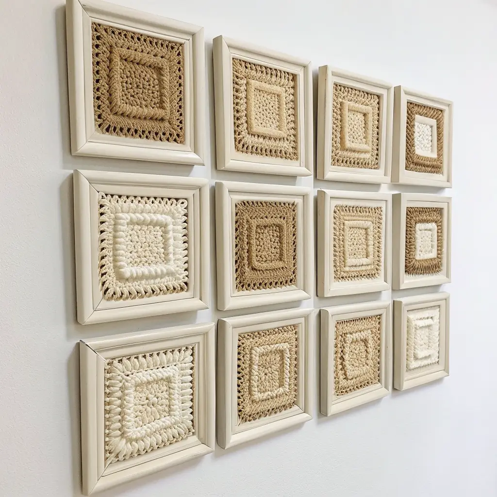
Grid arrangements are having a serious moment in interior design, and when you create them using crochet pieces, you get all that clean, organized aesthetic with the added warmth of handmade texture. I installed a neutral crochet wall grid in my home office, and it completely transformed the space from boring to intentional.
What makes a grid arrangement work: Repetition with subtle variation creates visual rhythm. You’re using the same basic format (square or rectangular panels) repeated in a grid pattern, but the crochet allows for textural and pattern variations within that structure.
Panel creation: I make individual square panels (usually 10×10 inches or 12×12 inches) using different crochet patterns for each one. Some use granny square patterns, others feature simple stripes, and others incorporate textural stitches. The variation keeps it interesting while the uniform size and neutral colors create cohesion.
Neutral color strategies:
- All white or cream for maximum minimalism
- Shades of gray from light to charcoal for subtle variation
- Natural tones—beige, tan, oatmeal, and cream
- White, gray, and black for graphic contrast
Grid layout options: I’ve experimented with different arrangements. A simple 3×3 grid (nine panels total) creates a perfect square. A 2×4 grid (eight panels) fits well on rectangular walls. Asymmetrical grids with varying panel numbers can look more dynamic and less predictable.
Spacing between panels: This matters more than you’d think. I keep consistent spacing of about 2-3 inches between each panel. Too close and they read as one piece. Too far apart and they lose cohesion. The spacing creates breathing room while maintaining the grid relationship.
Mounting solutions: I use small nails for each panel, measuring carefully to keep everything level and evenly spaced. A laser level makes this process infinitely easier and prevents the heartbreak of getting halfway through installation before realizing everything’s crooked :/
Frame or no frame: I’ve done both. Unframed panels have a softer, more organic feel. Framing each panel in simple frames (all matching) creates a more formal, gallery-like presentation. Both approaches work—it depends on your overall room aesthetic.
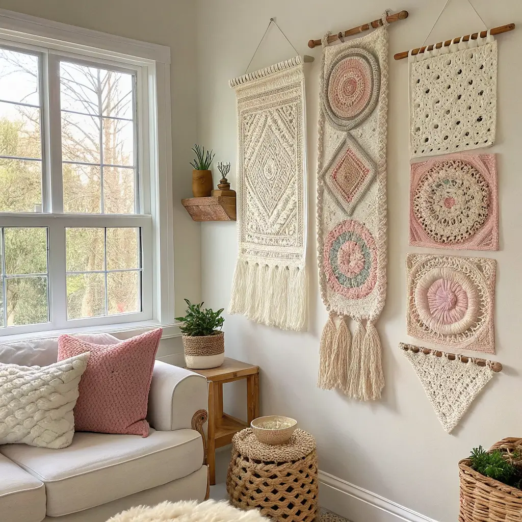
Vintage-Inspired Crochet Lace Wall Art
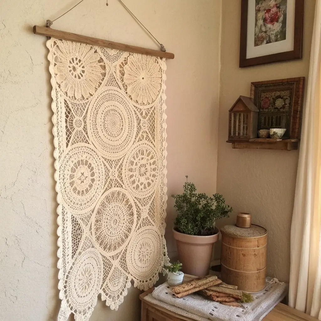
There’s something incredibly romantic about vintage crochet lace patterns, and when you frame them as wall art, you preserve that nostalgic beauty while making it work in contemporary spaces. I inherited some of my grandmother’s doilies and transformed them into framed art pieces, and honestly, it’s one of my favorite things I’ve ever done with crochet.
Sourcing vintage patterns: You can use actual vintage pieces (check thrift stores, estate sales, or family attics) or recreate vintage patterns using modern thread. I’ve done both, and each approach has its charm. Vintage pieces come with history and patina. New pieces give you control over color and condition.
Thread vs. yarn: Authentic vintage lace typically uses fine crochet thread (size 10 or finer). This creates the delicate, intricate look that defines the style. Working with thread requires patience—it’s slower than yarn work—but the results are stunning and precise.
Framing vintage lace: The frame matters enormously here. I use deep shadow box frames that hold the lace slightly away from the backing. This creates dimension and allows light to pass through the open spaces in the lace work, which is kind of the whole point.
Backing choices: I’ve experimented with different backings behind the lace:
- Fabric backing – Linen or cotton in neutral colors provides soft contrast
- Painted wood – Creates more rustic, farmhouse vibe
- Colored mat board – Offers clean, gallery-like presentation
- No backing – Let the lace float in the frame with light behind it
Color considerations: Traditional vintage lace is white or ecru, which works beautifully. I’ve also tea-dyed white lace to create aged, antique appearance. Some people work vintage patterns in modern colors like blush pink or dusty blue for a fresh take on classic designs.
Pattern selection: Not all doily patterns translate well to wall art. I look for patterns with clear, bold motifs that read well from a distance. Super delicate, fine patterns can look like white noise when framed. Pineapple patterns, rose medallions, and geometric lace designs work particularly well.
Creating sets: I’ve made sets of three or five framed vintage lace pieces in varying sizes arranged together. The repetition of the lace style with size variations creates cohesive but dynamic displays that work beautifully in bedrooms, hallways, or dining rooms.
Also Raed: 15 Elegant Foyer Ideas Entryway for a Luxe Look
Layered Crochet Wall Banners
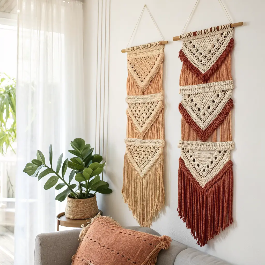
Banners bring this casual, approachable vibe to wall decor, and when you layer different elements within the banner format, you create depth and visual interest that simple flat banners can’t achieve. I made a layered banner for my daughter’s room, and the dimensional quality makes it genuinely special.
What makes a banner “layered”: You’re combining multiple elements at different depths—perhaps a solid background panel, appliquéd shapes on top, and then fringe or tassels hanging below. The layers create shadows and dimension that change as lighting shifts throughout the day.
Construction approach: I start with a main banner panel (usually rectangular, about 12 inches wide and 18-24 inches long). Then I add appliquéd elements like shapes, letters, or motifs. Finally, I attach fringe, tassels, or hanging elements at the bottom. Each layer adds depth.
Dowel or branch hanging: I thread a wooden dowel through the top of the banner, with the dowel extending beyond the banner edges on both sides. You can also use a natural branch for more organic, rustic feel. I attach cord or twine to the dowel ends for hanging.
Layering techniques:
- Different colored panels stacked and offset
- Appliqués attached with surface stitching for added texture
- Pom-poms or tassels in varying lengths
- Ribbon or fabric strips woven through crochet work
Color layering: I love using an ombre or gradient approach in layered banners—lighter colors on top transitioning to darker at the bottom, or vice versa. This creates natural visual flow and makes the layers more distinct and intentional.
Personalization options: Banners work perfectly for personalized pieces. I’ve made them featuring names, initials, or meaningful words. The banner format feels less formal than framed pieces, making it perfect for kids’ rooms or casual spaces.
Seasonal banner swaps: Because banners are relatively quick to make (compared to large tapestries), I’ve created seasonal versions that I rotate throughout the year. Spring florals, summer sunshine themes, autumn leaves, winter snowflakes—the banner format works for all of them.
Nature-Themed Leaf Crochet Wall Decor
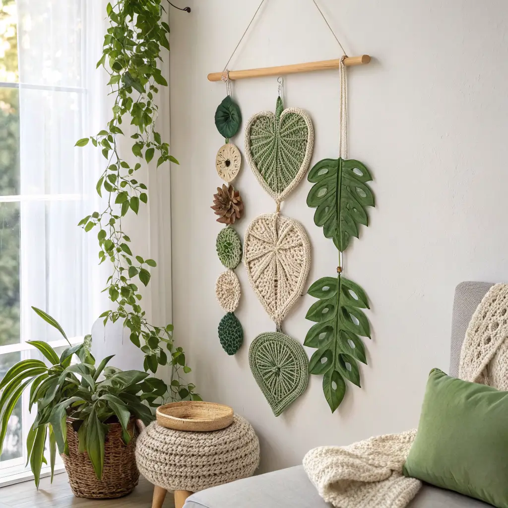
Bringing natural elements into your home through crochet creates this perfect blend of organic inspiration and handmade warmth. I’ve made various nature-themed pieces, but leaf motifs remain my absolute favorite for wall decor. They’re recognizable, versatile, and surprisingly impactful.
Leaf pattern varieties:
- Realistic leaves – Oak, maple, or monstera leaves with detailed vein work
- Simple stylized leaves – Basic leaf shapes that suggest nature without exact replication
- Fern fronds – Long, delicate patterns perfect for vertical arrangements
- Tropical leaves – Palm fronds or banana leaves for bold, graphic impact
Arrangement approaches: I’ve created wall decor using leaves in several ways. Mounting individual leaves directly to the wall in an organic scatter pattern looks fresh and modern. Attaching multiple leaves to a branch or dowel creates a more structured botanical display. Framing a single impressive leaf makes it feel like a botanical specimen.
Color realism vs. artistic interpretation: Real leaves mean greens and earth tones, which work beautifully. But I’ve also made leaves in unexpected colors—dusty pinks, soft blues, or even metallics—for more artistic, less literal interpretations. Both approaches work depending on your overall aesthetic.
3D vs. flat leaves: Flat leaves work great for framing or mounting directly to walls. Three-dimensional leaves (created using increases and decreases to create cupping) look more realistic and create beautiful shadows. I’ve even lightly wired some leaves so they hold interesting curved positions.
Sizing for impact: Tiny leaves get lost on walls. I go for leaves that are at least 8-10 inches long, and often larger. My monstera leaf piece features leaves about 16 inches across, and they make a serious statement without being overwhelming.
Stem and branch elements: Adding crocheted stems, vines, or mounting leaves on actual branches creates more complete botanical displays. I’ve attached leaves to driftwood branches I found at the beach, creating nature-inspired pieces that combine found objects with handmade elements.
Seasonal variations: Autumn leaves in oranges, reds, and golds. Spring leaves in fresh greens and yellows. Winter leaves in whites and silvers. The leaf format works beautifully for seasonal rotation, and I’ve built quite the collection over the years.
Modern Geometric Crochet Wall Hanging
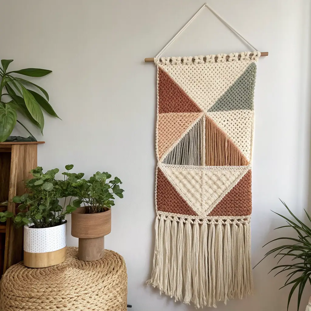
Geometric patterns bring order, clarity, and modern sophistication to crochet wall decor. I was initially intimidated by geometric work—it seemed like it required math skills I definitely don’t have—but once I discovered the right patterns and approaches, these became some of my favorite pieces to create.
What defines modern geometric crochet: Clean lines, precise angles, bold shapes, and often high contrast. You’re creating pieces that feel contemporary and graphic rather than soft and traditional.
Geometric shape options:
- Triangles – Arranged in various configurations and colors
- Hexagons – The classic geometric shape, arranged in honeycomb patterns
- Diamonds – Create dynamic, angular compositions
- Chevrons and zigzags – Provide movement and energy
- Abstract geometric compositions – Mixing multiple shapes
Color blocking: This technique really shines in geometric work. I use bold color combinations—navy and mustard, black and blush pink, charcoal and cream. The clean shapes provide structure while the color contrast creates visual impact.
Precision requirements: Geometric work demands accuracy. Your stitches need to be consistent, your tension even, and your edges straight. Any wobbles or irregularities disrupt the clean geometric aesthetic. I actually use a ruler while working to keep edges straight and check my work frequently.
Pattern planning: Graph paper becomes your best friend for geometric designs. I map out my entire piece before starting, ensuring the geometry works mathematically and visually. This planning stage prevents frustrating discoveries mid-project that your shapes don’t actually fit together properly.
Mounting geometric pieces: I mount most geometric work on painted canvas or foam board before framing. This gives the pieces structure and ensures they hang flat without warping. The geometric nature of the work demands that level of precision in presentation.
Size and scale: Geometric pieces can work at any size, but I’ve found that larger works (24×36 inches or bigger) really let the patterns shine and create proper impact. Smaller geometric pieces can look busy or cluttered unless they’re extremely simple in design.
Also Raed: 15 Stylish Narrow Entryway Decor Tricks for Small Spaces
Cozy Cottagecore Crochet Wall Art
Okay, let’s talk cottagecore—that aesthetic that makes you want to bake bread, pick wildflowers, and live in a cozy cottage in the woods. Crochet and cottagecore are basically soulmates, and creating wall art in this style brings such warmth and comfort to any space. I made a cottagecore-inspired piece for my reading nook, and it instantly transformed the corner into my happy place.
Essential cottagecore elements:
- Soft, vintage-inspired colors – Dusty rose, sage green, butter yellow, soft lavender
- Floral and botanical motifs – Flowers, leaves, vines, and garden elements
- Romantic, delicate details – Lace-like patterns, scalloped edges, and dainty touches
- Natural materials – Cotton yarn in natural or gently dyed colors
- Handmade, imperfect charm – Cottagecore embraces the handmade quality
Pattern inspirations: I draw from vintage doily patterns, traditional granny squares, and classic lace motifs. The goal is creating something that feels like it could have been made decades ago but still works in contemporary spaces. Cottagecore isn’t about perfect precision—it’s about charm and coziness.
Incorporating found elements: I love combining crochet with natural found objects in cottagecore pieces. Attaching crochet work to vintage frames I’ve aged with paint, incorporating dried flowers alongside crocheted blooms, or using branches and twigs as structural elements adds to that collected-over-time, cottage aesthetic.
Layered textile approach: Cottagecore loves layers, so I combine crochet with other textiles—lace, cotton fabric, ribbon, and burlap. A crochet piece mounted on linen fabric, accented with vintage lace trim and hung with silk ribbon creates that rich, layered look.
Color palettes for cottagecore:
- Soft pastels in pinks, blues, yellows, and greens
- Earthy neutrals with pops of muted color
- Vintage-inspired tea-stained whites and creams
- Garden-inspired combinations of florals and greenery
Display methods: Cottagecore pieces look beautiful in vintage frames, embroidery hoops wrapped with fabric or ribbon, or simply hung from pretty branches. I avoid modern, sleek frames—they don’t match the aesthetic. Ornate vintage frames, distressed wood frames, or even no frames at all work better.
Personal touches: Adding hand-embroidered details, vintage buttons, or meaningful quotes elevates cottagecore crochet from craft to genuine artistic expression. I’ve incorporated my grandmother’s buttons into pieces, added hand-embroidered dates or initials, and included fabric scraps from meaningful clothing. These personal elements make cottagecore pieces deeply meaningful 🙂
Bringing It All Together
There you have it—a complete tour through the wonderful world of crochet wall decor, from boho mandalas to cottagecore charm and everything in between. The beauty of crochet as a medium for wall art is its incredible versatility and the warmth it brings to any space.
What I love most about creating crochet wall decor is the control you have over every single aspect. You choose the colors that perfectly match your space, the size that fits your wall, the style that speaks to your aesthetic, and the techniques that match your skill level. You’re not settling for mass-produced options—you’re creating something genuinely unique.
Start wherever your interest and skills intersect. Beginners might love the straightforward beauty of minimal hoop art or simple floral panels. Intermediate crafters could tackle geometric pieces or textured tapestries. Advanced crocheters might enjoy the challenge of intricate vintage lace or dimensional layered banners.
And honestly, don’t stress about making everything perfect. Some of my favorite pieces have little quirks and irregularities that I initially considered mistakes but now recognize as character. The handmade quality is the entire point—embrace those imperfections as proof that human hands created something beautiful.
Your walls are waiting, your yarn stash is ready (I know it’s there), and you’ve got all the inspiration you need. Go transform those blank spaces into showcases for your creativity. Trust me, there’s nothing quite like the satisfaction of looking at a gorgeous wall hanging and knowing you created it yourself, one stitch at a time.